


Winner of a GDUSA 2020 American Inhouse Design Award.
As USGBC continues to grow, so has our brand. To usher in the second generation of USGBC, we are sharing an updated visual brand that brings the spirit of USGBC and its community to life. As we remain deeply engaged with our existing community, and build connections with new audiences, our updated identity feels fresh yet familiar, sophisticated yet relatable, modern yet timeless.
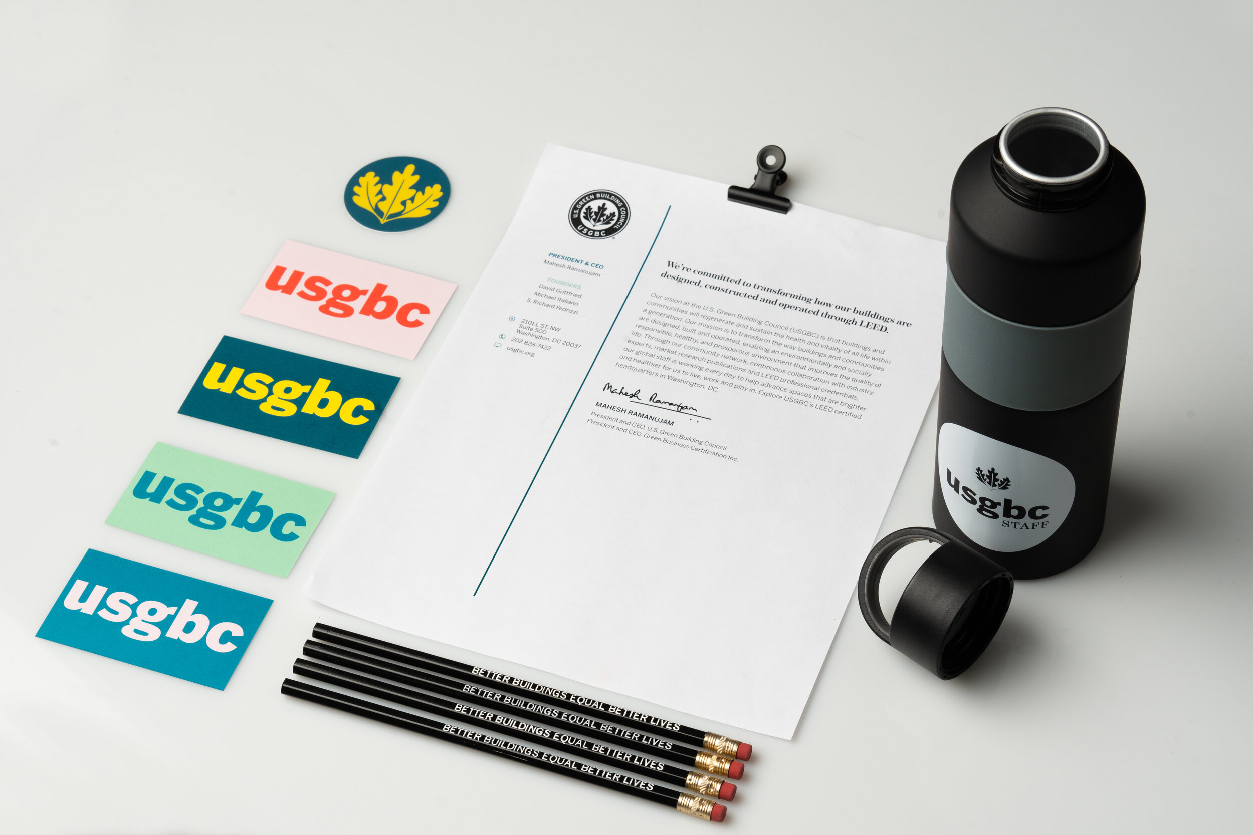
This project included introducing new brand guidelines for USGBC. I introduced a new wordmark to represent our staff better, as well as a new application for our recognizable oak leaves. I created a new, simplified color palette that focused on blues to instill the feeling of loyalty and stability. I introduced two new fonts that offer less severe transitions and stroke weights, ensuring they have a humanist tone of voice. I also prepared a staff toolkit that included social graphics, how to be a brand ambassador, and how to talk about our brand refresh with our customers.
I also illustrated a custom suite of iconography and illustrations that can be used when representing complex or more abstract ideas, especially when paired with article content published online, in email distributions or on social media. Our iconography and illustrations make use of our new color palette, and help communicate personality, moods or emotions, and show a diversity of visual styles.
We launched the brand refresh with a day of “teasers” on social media, followed by a video launch on March 5, 2020. While a refresh isn’t a total rebrand, we want our audience to know that we still stand by the same mission even though we’ve got a slightly updated look. You can read even more here.